Out with the old
I absolutely love what I do and realised that I didn’t want to retire. I no longer wanted to have a team of consultants and I no longer had any plans to sell the business at a future date.
I also realised that the Milestone Experts brand was looking somewhat tired and out of date and no longer reflected my business or my aspirations. I was still providing sales and customer service training but 1-1 and team leadership coaching was becoming a bigger and bigger part of what I was doing.
Like many businesses, I had always had a small budget for marketing assets. I had created a logo, brand, website and other marketing assets on a small budget and that had worked to a point. With my new brand I wanted to do things differently, bigger and better.
In with the new
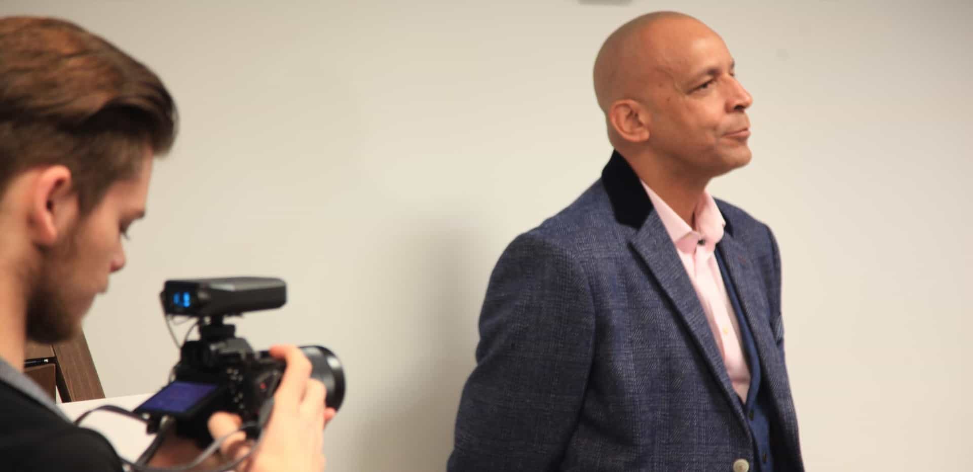
I realised I would need help if my new brand was going to be different, bigger and better. After doing lots of research and meetings I decided to enlist the help of the team at ‘We are Jago’ www.wearejago.com They are experts in design and marketing. During our meetings everything they said and did was focused on making me and my new brand look good, feel good and gain greater visibility. I used Jago as they understood my aspirations and their design was in keeping with my vision.
New name
One of the biggest decisions I had already made was that my new brand would carry my name. I had avoided this in the past as I didn’t want to sell a business that I had such a personal attachment to. As I mentioned earlier, I no longer desire to sell my business or retire so having a business carrying my name felt right. After discussing the various options with the team at Jago I decided my new business name would be ‘Gary Morgan Coaching’. I wanted the new brand name to reflect the increase in 1-1 and team coaching that I have been doing more and more of in recent years, although I will still be offering the same high level of customer service and selling skills training and coaching.
New logo
My new logo is based on the Japanese art form Origami. It’s about transformation, taking a blank piece of paper and creating something. It’s in line with what I do when engage by clients; we start with a blank piece of paper and create something magical. Whether it’s creating leaders, sales teams or customer service teams. Whatever it is ends up being magical for both the people and the business. The mountain peaks in the logo represent challenges and achievements. I have seen it time and again whether I am working with a business or an individual that there are always challenges but when I they are engage my services, they always end up achieving far more than they thought was possible. It’s so important in life and in business to constantly challenge ourselves, in fact, very often the bigger the challenge the bigger the achievements.
Colour choice
The colour palette that we agreed on is built around the three main reactions to colour:
- Physical
- Intellectual
- Emotional
We wanted to create something that targets all three states: red to initially grab attention and stimulate physically; blue creates a mental space for clear communication and trust; yellow stimulates emotion and is associated with optimism and confidence. These colours fit perfectly with my values and beliefs. I am often talking to my clients about the importance of grabbing attention (red), creating space for communicating clearly and building trust (blue) and finally being optimistic and increasing confidence (yellow).
What’s next?
My new brand Gary Morgan Coaching is now up and running. I have a logo, website and other assets that I am immensely proud of. Most of all I have a brand and a business that can help individuals and teams to reach their potential. Why don’t you “Make that leap. Awaken your true potential.” Contact me Gary Morgan on 020 8337 5937 or hello@garymorgan.co
I look forward to hearing from you.
Gary.
Sign-up to my Newsletter
Periodically, I send a newsletter to my clients and valued contacts containing business and personal growth tips, strategies and articles. If you would like to receive these simply enter your email address below.